A large selection of masters and salons in the beauty market creates a need to stand out, to clearly declare one’s individuality. The logo for the beauty salon Stanislavskyh Group became just such an appeal. It was a joint attempt by LF.agency professionals and beauty salon owners to reveal and emphasize the uniqueness of the brand.

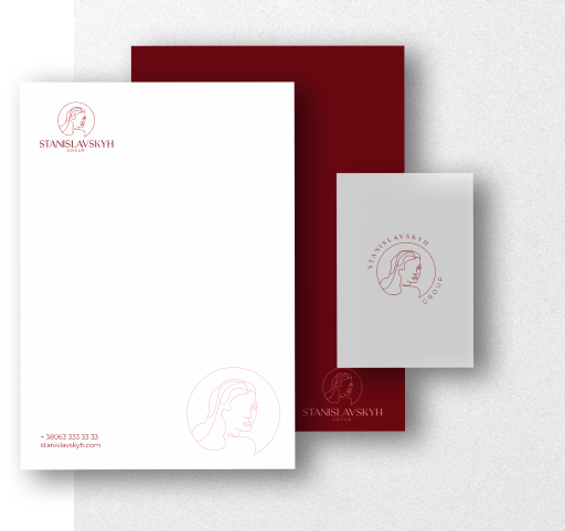
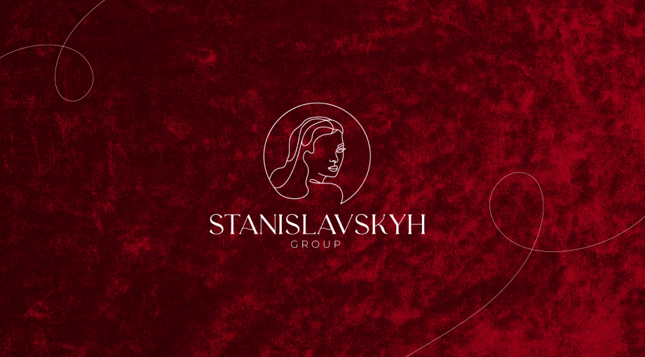
A sophisticated logo with a thin line of letters is what LF created for the Stanislavskyh Group. The woman depicted on the logo makes it easy to understand which target audience the company works for, creating the first point of contact. Lettering also reflects premium service. The simultaneous angularity and roundness of the lines successfully balance the overall look of the identity, making it clear that every character and expression of personality is welcome in the beauty salon. The salon and the owners were satisfied with the result of the logo and the selection of the color range created at LF.agency. A thorough approach to creation was especially appreciated.

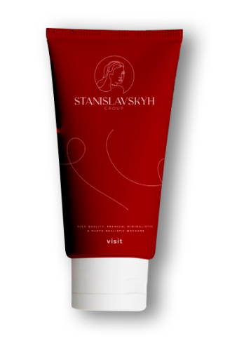
The Stanislavskyh Group logo on packages is a simple and effective way for the company to continue communicating with clients when they are outside the salon.
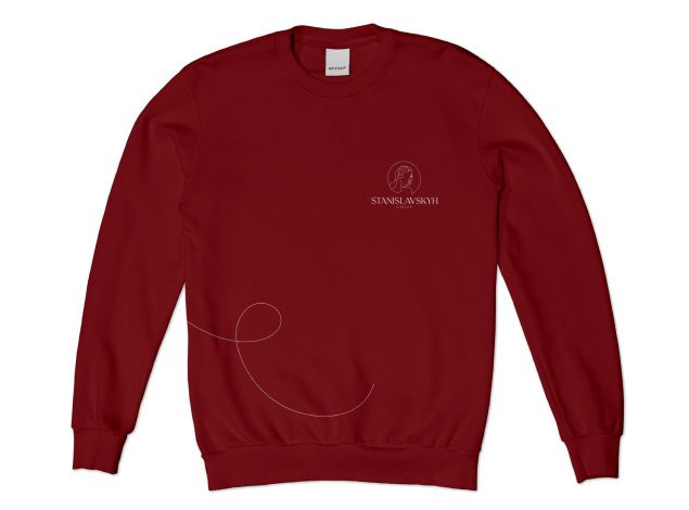
The company’s unique clothing style creates a sense of unity for employees, as well as recognition for clients.
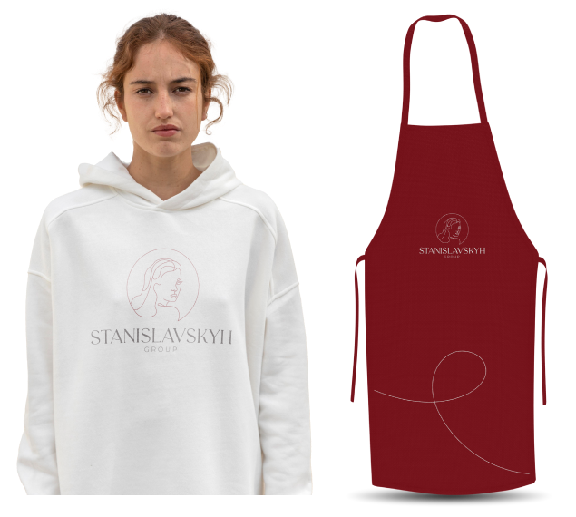
The sophistication of the logo makes it possible to make a thing a favorite not only within the salon, but also outside it. For example, such a sweater can be happily worn on the street, making the company logo more recognizable.