Three Kings Coffee is a British coffee brand with which the LF team has been cooperating for four years. The joint efforts not only managed to update the corporate style and develop a series of packaging/labels/banners, but also to increase the brand’s sales and profits.
The client turned to us with the task of developing a logo, which ended in fruitful cooperation over a long period. Inspirational interaction between the team and the customer is LF’s favorite scenario!


The logo of Three Kings Coffee, which started the collaboration, is a crown formed by coffee splashes above the cup. Dynamic, aesthetically pleasing and memorable. This image is easy to draw, sitting carelessly on the summer terrace, with a pen, a napkin and a cup of your favorite coffee nearby. Easy reproducibility of the logo is a sign of high-quality team work.


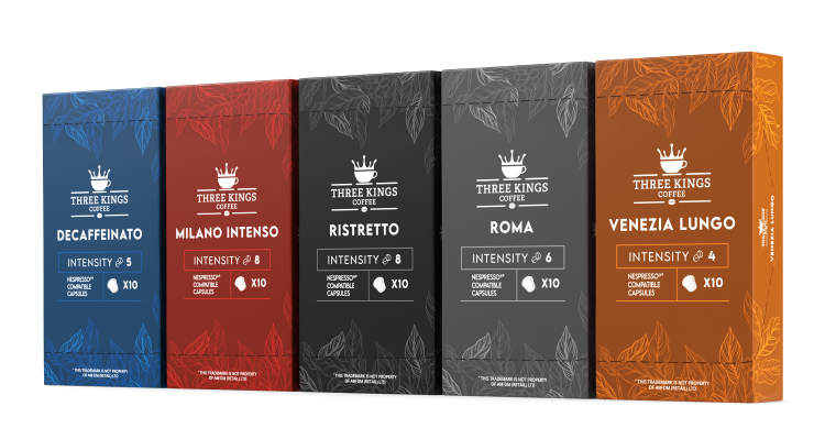
Development of a successful logo, small adjustments to the corporate style, and then the client orders the design of several coffee packages in the style he had before the meeting with LogoFactory. Our proposal was to make all packaging more stylish: bright but muted colors, a combination of serif and sans serif fonts, subtle elements that reproduce the leaves and beans of the coffee tree. After a successful test drive of one package, other five were created and as a result sales increased!


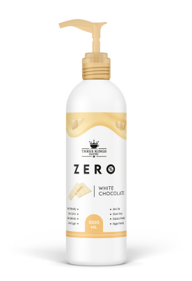
LogoFactory designed not only coffee packaging, but also a line of labels for syrups and dessert sauces from Three Kings Coffee. The moving display of the contents of the syrup bottle in the form of drips, already recognizable brand font, trendy pastel colors of the syrup labels, which are interspersed with the brightness of the sauce labels created a perfect combination.
Cooperation is not limited to products for physical and virtual store shelves. We are constantly in touch to create advertising creatives, visuals for social networks and various banners for the site. Are you interested in the case and want to cooperate? Contact the LF team!